The Familiar Patterns of Fuel Poverty

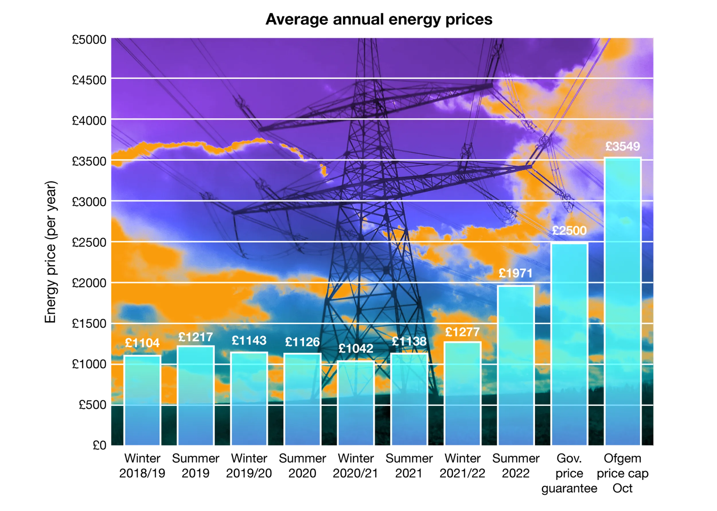
In April 2022, the energy price cap experienced a significant increase of 54%, resulting in an estimated 6.2 million households being pushed into fuel poverty.
This situation is expected to worsen.
Another round of fuel price increases is scheduled for October, potentially causing annual household energy bills to exceed £2000. An additional 2.2 million households will fall into fuel poverty. The fuel poverty gap, which was £223 in 2020, is projected to expand significantly when the official figures for 2022 are eventually released. Here are some key terms:
- Fuel poverty occurs when a household's necessary fuel costs exceed the average level, and meeting those costs would leave the household with a residual income below the official poverty line.
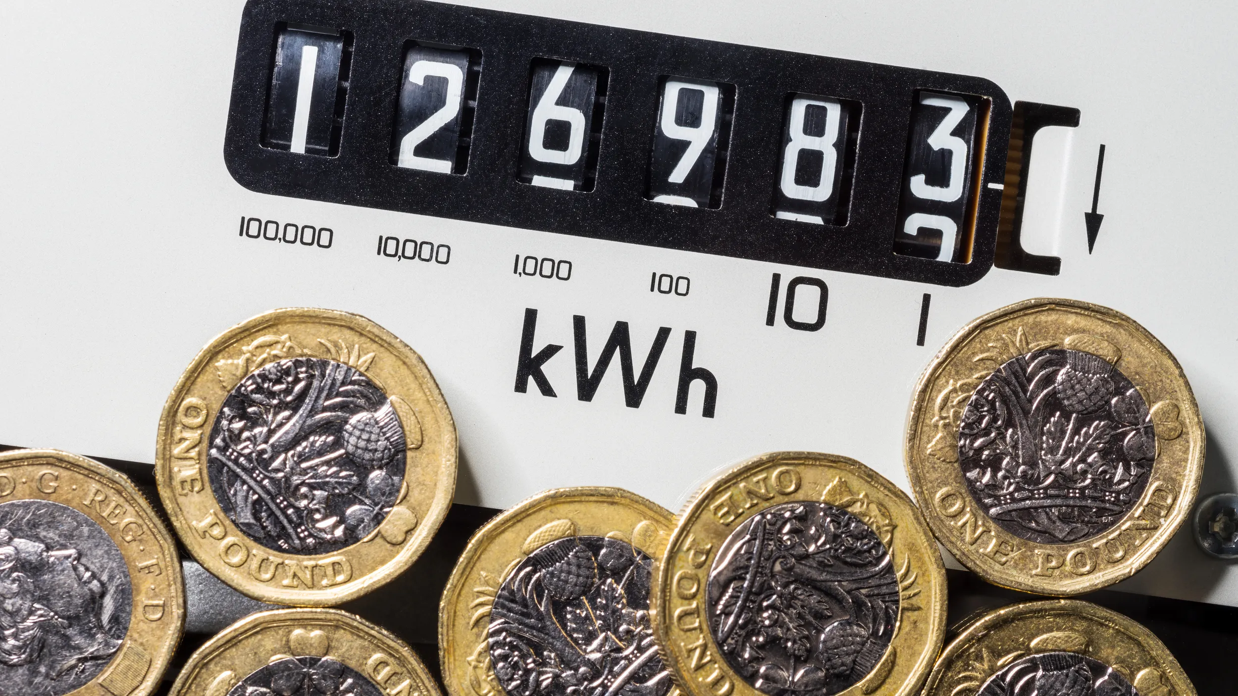
- The energy price cap sets an upper limit on the charges that suppliers can impose for gas and electricity. It undergoes review every six months. In April 2022, the price cap was raised by 54%.
- The poverty gap represents the difference between a household's average energy bill and the amount at which the bill would need to be in order for the household to no longer be considered fuel poor.
The Chief Executive Officer of energy supplier E.on predicts that approximately 40% of UK households will experience fuel poverty in 2023.
To be plunged into the depths of fuel poverty, a perfect storm of factors must align:
- Low income
- Steep increase in energy cost
- Home with poor energy efficiency
- Inability to afford owning a home
- Substandard quality of private rental housing
At present, this is a common occurrence. According to the End Fuel Poverty Coalition, nearly half of low-income households still reside in energy inefficient homes. Furthermore, increases in fuel prices are expected to disproportionately affect those with low incomes, as fuel costs consume a significant portion of their disposable income.
Recent research conducted by the Joseph Rowntree Foundation reveals the following proportions of income allocated to energy bills:
- Middle-income family: 6% of their average income
- Low-income family: 18% of their income
- Lone parents and couples without children: 25% of their income
- Single-adult households on low incomes: Up to 54% of their income on gas and electricity
Is there a geography of fuel poverty?
Areas most affected by fuel poverty are by and large the old industrial regions, and other areas in need of “levelling up”, While the South East, the South West and to some extent East Anglia fare much better, with the exception of London:
Region | % Neighbourhoods in Fuel Poverty |
West Midlands | 41 |
Yorkshire and Humber | 35 |
North East | 26 |
London | 25 |
North West | 24 |
East Midlands | 20 |
East of England | 15 |
South West | 4 |
South East | 1 |
Upon delving into the data at the local authority level, the observed regional pattern repeats to a certain extent:
Local Authority | Region | % of Neighbourhoods in Fuel Poverty |
Newham | London | 73 |
Stoke on Trent | West Midlands | 69 |
Barking and Dagenham | London | 68 |
Wolverhampton | West Midlands | 65 |
Waltham Forest | London | 64 |
Sandwell | West Midlands | 61 |
Manchester | North West | 59 |
Birmingham | West Midlands | 59 |
Hull | Yorks and Humber | 53 |
Leicester | East Midlands | 53 |
Walsall | West Midlands | 53 |
Haringey | London | 50 |
Norwich | East of England | 49 |
Kings Lynn | East of England | 48 |
Barnsley | Yorks and Humber | 47 |
Nottingham | East Midlands | 47 |
London stands out with three local authorities (LAs) ranking among the worst five. The West Midlands contributes to approximately one-third of the local authorities in the worst-performing category. Kings Lynn, despite being a rural area, appears in the table, which is surprising as the majority of these LAs are in city regions, which tend to house a significant portion of the communities labelled as "left behind" by the government.
Friends of the Earth have developed an exceptional interactive map that provides a comprehensive overview of fuel poverty patterns across England.
Fuel poverty and multiple deprivation share an apparent connection.
The link between low income and fuel poverty is evident, as low income constitutes a component of deprivation. Therefore, a strong correlation between fuel poverty and the index of multiple deprivation should logically exist. Surprisingly, there seems to be limited research conducted in this field, resulting in sparse evidence. A research paper published by the University of Sheffield in 2019 sheds some light on this relationship.
Through a series of correlation coefficients, the study discovers that the correlation between fuel poverty and multiple deprivation varies across the regions of England:
- The North East and the Midlands exhibit the strongest correlation.
- London demonstrates the weakest correlation.
- Major cities display a wide range of correlations, ranging from strong to non-existent.
- At the level of Local Authorities, certain neighbourhoods exhibit strong correlations while others demonstrate weak correlations.
Clearly, there are other contributing factors at play. Drawing on government data, Friends of the Earth have produced a report that highlights the following findings:
- Young people are more susceptible to living in fuel poverty compared to older individuals. Approximately 25% of households within the age bracket of 16-24 are classified as fuel poor, whereas the figure for 60-74-year-olds is 11%.
- Fuel poverty disproportionately affects individuals who rent their homes rather than those who own them. Only 8% of privately owned homes are considered to be in fuel poverty, while 27% of households in the private rental sector are classified as fuel poor, in contrast to 18% for social housing.
- People of colour are twice as likely as their white counterparts to reside in neighbourhoods with an "E-rated" classification, indicating a greater propensity for fuel poverty (38.9% versus 17.5%).
- Neighbourhoods with a significant proportion of individuals facing health and disability challenges tend to have a higher prevalence of households experiencing fuel poverty.
A one-size-fits-all approach to addressing the issue is unlikely to be effective.
The causes of fuel poverty are multifaceted. Drivers of fuel poverty exhibit regional variations as well as variations within regions. Low income is evidently a contributing factor, along with the imperative to manage or mitigate the impact of escalating energy prices. Increased attention must be directed toward addressing energy inefficiency. Notably, a significant portion of privately rented housing falls short of the required standards, emphasising the need to encourage private landlords to enhance the energy efficiency of their properties.
Young people face significant challenges in qualifying for social housing rental.
Instead, they are more likely to find themselves in privately rented accommodations, particularly in major cities such as London, due to the unaffordability of homeownership. This circumstance may help explain the high percentage of young people experiencing fuel poverty, attributable to the inadequate or fuel-inefficient properties they inhabit. Despite having relatively higher incomes, the burden of high rental costs offsets their financial resources.
The availability of social housing has also diminished substantially. Council housing, which constitutes publicly owned and managed housing by local authorities, reached its peak in the post-war era, accounting for 32% of the UK housing stock. However, by 2018, this percentage had plummeted to a mere 8%, reflecting a staggering loss of 4.5 million council homes since 1979. Low-income households find themselves compelled to seek privately rented accommodations, a significant portion of which, as previously discussed, lack energy efficiency.
Two potential solutions exist: the construction of additional social housing, though the likelihood of necessary policy changes remains unlikely, and the implementation of stringent measures to enhance the energy efficiency of privately rented accommodations.
The impact of fuel cost increases disproportionately affects the poorest people.
Energy expenditure demonstrates less income variation compared to other spending categories, resulting in lower-income households allocating a larger portion of their family budgets to meet energy needs compared to higher-income groups. Any rise in energy prices will have a more pronounced effect on lower-income households. Recent and projected price escalations for 2022 indicate that the poorest 20% of households would need to allocate an additional £850-950 to maintain their energy consumption at the same level as in 2019-20.
Fuel poverty significantly undermines public health.
- There is evidence linking cold temperatures to respiratory ailments, including COVID-19 (GOV.UK).
- Dampness and mould are associated with a 30-50% increase in respiratory problems (Ruse & Garlick).
- Mitigating preventable illnesses arising from cold homes becomes imperative in safeguarding the NHS and care services. The healthcare system bears a daily cost of £3.6 million due to fuel poverty (Kingston).
- The number of excess deaths in the UK annually from December to March, indirectly resulting from fuel poverty, surpasses those caused by alcohol, Parkinson's Disease, or traffic accidents, reaching 32,000 individuals. 11,400 winter fatalities can be attributed to cold homes (NEA).
- Fuel poverty leads to work absences due to illness (IPPR).
You may find the following sources useful for further research:
- Department for Business, Energy & Industrial Strategy Annual Fuel Poverty Statistics in England, 2020 (2018 data)
- Department for Business, Energy & Industrial Strategy Fuel Poverty Factsheet England, 2020
- End Fuel Poverty About fuel poverty
- Friends of the Earth Who’s impacted by fuel poverty in 2023?
- Plumplot Area insights maps
- University of Glasgow Fuel Poverty and Income Deprivation in Bristol, UK
- University of SheffieldExamining the relationship between energy poverty and measures of deprivation
Related News, Tips & Resources


Find exactly what you’re looking for.
- Popular Searches
- Biology
- Chemistry
- Geography
- A Level Media Studies
- Physics
- A Level Environmental Science
Newsletter
General
Work with us
Get in touch
- © 2026 Curriculum Press
- Terms & Conditions
- Privacy & Cookies
- Website MadeByShape